Changing the atmosphere of a room doesn’t necessarily require a complete overhaul. Sometimes, replacing a floor covering, rearranging two pieces of furniture, or simply altering the color palette is enough to transform an interior. The 2026 decoration trends confirm this idea: they favor raw materials, dark woods, and visible textures over heavy renovations. Here’s how to translate these orientations concretely, room by room.
Dark wood and artisanal materials: the foundation of 2026 decor ideas
Have you noticed that recent interiors are moving away from bleached oak? The shift is clear. Walnut, stained oak, and rich woods are gradually replacing the blonde finishes that have dominated for several years. This change affects the living room, kitchen, and bedroom.
Dark wood brings immediate depth. A walnut sideboard in a light living room creates a visual anchor without overwhelming the space. In the kitchen, dark stained fronts combined with a light stone countertop produce a sharp and contemporary contrast.
At the same time, smooth surfaces are giving way to visible textures. Matte micro-cement on the floor, raw ceramic as a backsplash, terracotta on the walls: the trend embraces intentional imperfection. Handmade tiles, with their slight color variations, add more character than industrial rectified tiles. Crumpled linen, boucle wool, and irregular weaves complement this search for relief.
To explore the decor offered on Niddou, this type of material serves as a good starting point before choosing specific pieces.
Biophilic design in the living room: beyond green plants
Placing three pots on a shelf is no longer enough to qualify a space as “natural.” Biophilic design, as it is evolving for recent interiors, goes further. It incorporates natural light, living materials, and continuity between indoors and outdoors into the very structure of the room.
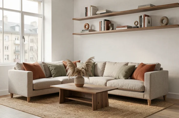
Specifically, it starts with light management. A south-facing living room with opaque curtains wastes its best asset. Replacing heavy curtains with sheer linen changes the perception of the entire space. The filtered light bounces off natural materials (wood, stone, rattan) and creates an ambiance that evolves throughout the day.
Next, consider the materials of the furniture. A raw wood coffee table with visible knots, a woven rattan armchair, a jute rug: each piece reinforces the connection with the outdoors. The goal is not to recreate a forest in the living room but to create a sensory coherence between what we see, what we touch, and the ambient light.
Biophilic design works when we forget it’s there. If the result looks like a garden center display, it’s a failure.
Néo-Art Deco style for the dining room
The dining room is often the most neglected space in terms of decoration. You place a table, matching chairs, sometimes a light fixture, and that’s it. Recent trends, however, make it a strong expression area, particularly through the neo-Art Deco style.
This style is recognized by a few specific elements:
- Marked geometric lines on furniture (fluted legs, arched backs, softened corner tops)
- Brass or brushed gold metal accents on sideboard handles, chair legs, or light fixtures
- Curved and sculptural shapes, especially for seating and pendants above the table
- Deep colors (forest green, midnight blue, burgundy) paired with warm neutrals
Néo-Art Deco works in touches, not in total looks. A brass pendant above a walnut table, two rounded-back chairs on one side, a geometric-framed mirror on the wall: three elements are enough to set the mood without falling into historical recreation.
Bedroom and sleeping area: muted colors and layered textiles
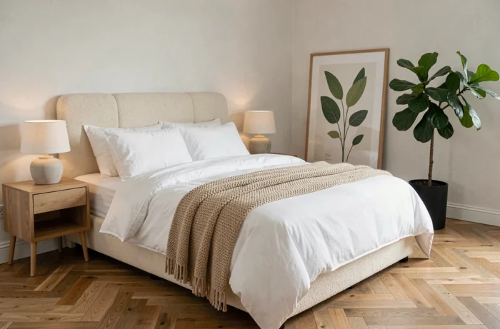
The bedroom follows a different logic than the living room. Here, the priority is sensory comfort, not visual effect. The palettes that work in 2026 are muted colors: faded terracotta, rosy beige, sage green, warm gray. These shades absorb light rather than reflect it, promoting relaxation.
Why talk about “layers” for textiles? Because layering creates a sense of comfort more than the quality of a single fabric. A boucle wool throw over a linen duvet, cushions of varying sizes and textures, a thick rug at the foot of the bed: each layer adds tactile depth.
A common pitfall in the bedroom: matching everything. A bedspread, cushions, and curtains in the same fabric produce a catalog effect. Mixing natural linen with thick knit and textured cotton yields a more vibrant, personal result.
Wall art and paintings: composing a wall without saturating it
Wall art remains one of the most accessible decor levers. A painting or a series of frames can transform a mundane hallway into a gallery. The challenge is not choosing the works but arranging them.
A simple rule works in most cases: limit the formats to two or three sizes maximum per wall. A large central format flanked by two small frames creates a clear rhythm. Five frames of different sizes arranged without logic produce visual noise.
- For a narrow wall (hallway, entry), a single vertical painting suffices and elongates the perspective
- For a wide wall behind a sofa, a horizontal composition of three pieces aligned on a central axis works better than an accumulation
- For a staircase, following the diagonal of the railing with frames of the same size avoids a chaotic effect
The choice of subjects matters less than the coherence of tones. A mix of photographs and illustrations works if the palette remains within the same color range as the rest of the room.
Current decor trends show a constant: the most successful interiors rely on material coherence rather than object accumulation. Dark woods, raw textures, a controlled palette, a few well-placed strong pieces. Each decor choice benefits from being tested in the actual light of the room, not on a screen. The best advice remains to live with a change for a few days before moving on to the next one.