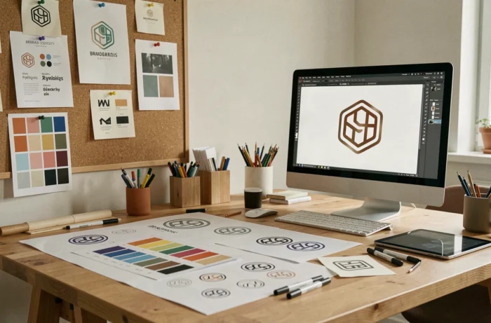
An impactful company logo relies on a set of precise graphic choices: shape, color palette, typography, level of detail. Each decision shapes the perception of the brand even before a word is read. The twenty tips that follow cover concrete techniques, visual biases, and design approaches applicable to any sector.
1. Play with negative space to create a double meaning
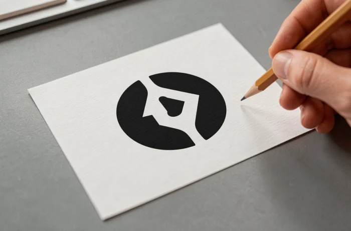
Negative space involves using the void between graphic elements to form a second image. The FedEx logo, with its hidden arrow between the E and the x, remains the most cited reference.
This technique works because it rewards the viewer’s attention. A visual double meaning enhances memorization since the brain registers two pieces of information in a single sign.
2. Design an adaptive logo system rather than a single file
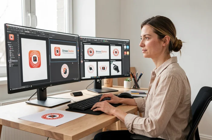
The static logo gives way to a dynamically adaptive logo system: a long version for the website header, a short version for social media, a simplified version for the favicon, an animated version for video. Exploring different business logo ideas allows visualization of how this logic of adaptation applies concretely.
Planning these variants from the design stage avoids having to tinker with cropping later. The main logo must remain legible even when reduced to a few pixels wide.
3. Invest in custom typography
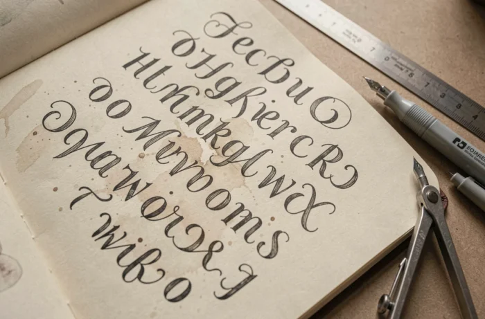
Using a font purchased from a type library exposes you to a simple risk: another brand will use the same one. Designing exclusive lettering, even for just two or three letters, gives a unique visual signature.
The Coca-Cola or Google logotype draws its strength from typography that can’t be found anywhere else. This approach suits brands that want their name alone to suffice for public identification.
4. Use pure geometry for instant readability
Circles, squares, triangles: simple geometric shapes can be decoded in a fraction of a second. Building a logo on a modular grid ensures harmonious proportions and perfect reproducibility across all media.
A geometric logo ages better than a logo loaded with details, as it does not rely on any fleeting graphic trend.
5. Integrate movement with an animated logo

On a website, an app, or in a video, an animated logo captures more attention than a static image. The animation can be subtle: a line being drawn, an element rotating, a color pulsing.
The animated logo does not replace the static version. It complements it for digital contexts where movement is native.
6. Work in monochrome first
Starting the design in black and white forces validation of readability, contrast, and structure before adding color. A logo that does not work in monochrome will not work in small formats or low-cost printing either.
Accessibility in grayscale has become a starting criterion, not just a simple checkpoint at the end of the project. Audiences with visual impairments perceive contrast first, not hue.
7. Leverage local cultural symbolism
A graphic element related to local geography or history anchors the brand in a territory. A stylized monument, a landscape silhouette, or a traditional craft pattern creates an immediate connection with the targeted audience.
The pitfall: the symbol must remain legible out of context. A tourist or foreign client should perceive an aesthetic form even without knowing the reference.
8. Create a monogram from initials
The monogram condenses identity into two or three intertwined letters. Louis Vuitton, Chanel, or Yves Saint Laurent have made it a luxury standard, but the technique also works for a small business or startup.
A well-designed monogram serves as a favicon, stamp, and watermark without any additional adaptation.
9. Adopt a limited two-color palette
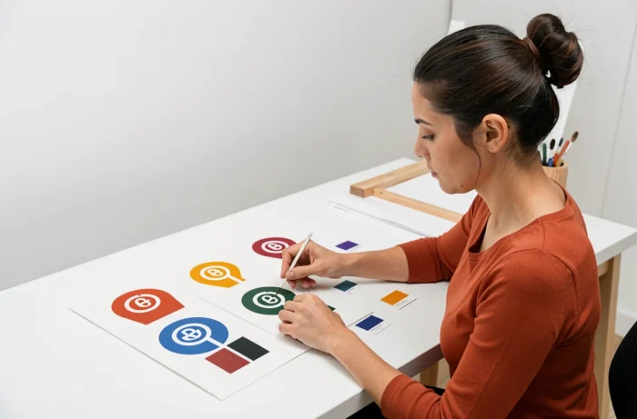
Limiting the palette to two colors forces clarity of message. Each hue carries an intention: a dominant color for the brand’s energy, a secondary color for contrast.
The most recognized logos in the world rarely use more than three colors. Two are enough to create a clear visual impact without overload.
10. Design a mascot or character
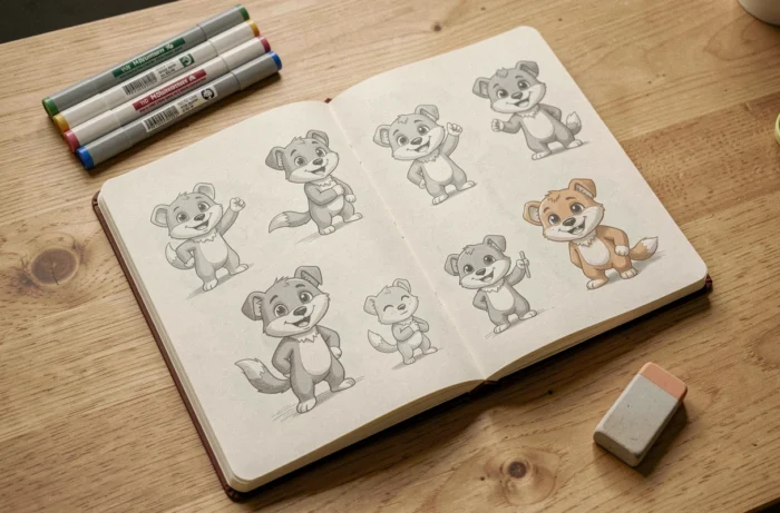
A mascot humanizes the brand and facilitates storytelling on social media. It can evolve over campaigns without changing the main logo.
The mascot works best in consumer sectors, food, sports, or education. In a highly technical B2B context, it may dilute perceived credibility.
11. Overlay transparent shapes
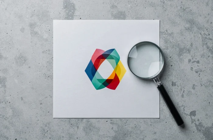
The overlay of translucent shapes creates intermediate shades at intersections. This technique gives an impression of depth and dynamism with a reduced number of elements.
The Mastercard logo uses this principle. The effect remains legible in print as well as on screen, provided the base colors are sufficiently contrasted.
12. Draw inspiration from nature and biomimicry

Leaves, waves, seashell spirals: organic shapes spontaneously evoke growth, sustainability, or harmony. A design inspired by nature does not necessarily imply an ecological positioning – it primarily brings visual fluidity.
Graphical biomimicry must remain stylized. A drawing that is too realistic loses readability at small scales.
13. Play with optical illusion

A logo that appears three-dimensional on a flat surface intrigues and holds the gaze. Illusions of perspective, rotation, or impossible depth transform a flat symbol into a memorable visual object.
This approach suits technological or creative brands that want to signal innovation from the very first visual contact.
14. Use a controlled gradient
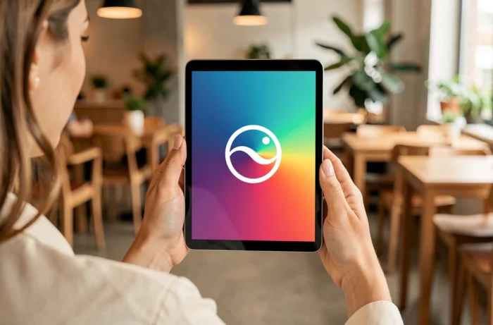
The gradient adds chromatic richness without multiplying flat colors. Instagram popularized this approach with its transition from a skeuomorphic logo to a vibrant gradient.
A gradient must always have a fallback in flat color for media that cannot reproduce it (engraving, embroidery, monochrome printing).
15. Integrate a hidden element related to the activity
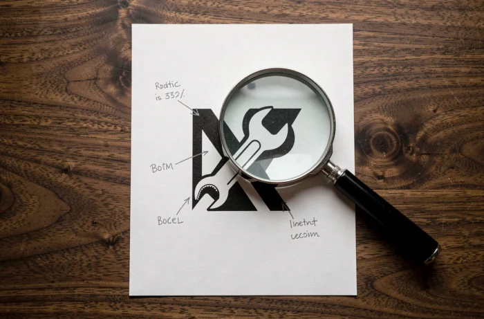
Unlike the double meaning through negative space, this involves slipping a micro-detail into the outline: a cup in the curve of a letter for a café, an arrow in a delivery logotype.
This type of detail creates a discovery effect that strengthens attachment to the brand.
16. Opt for a revisited retro or vintage style
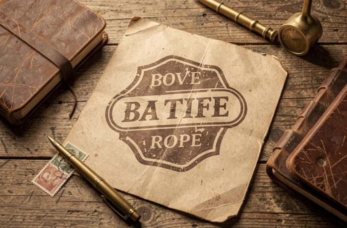
A retro graphic treatment (serif typography, frames, grain textures) evokes authenticity and craftsmanship. It works in crafts, restoration, brewing, or heritage fashion.
The common mistake: piling on too many embellishments. An effective vintage logo maintains a simple structure dressed with a few period details, not the other way around.
17. Test light-dark contrast for dark mode
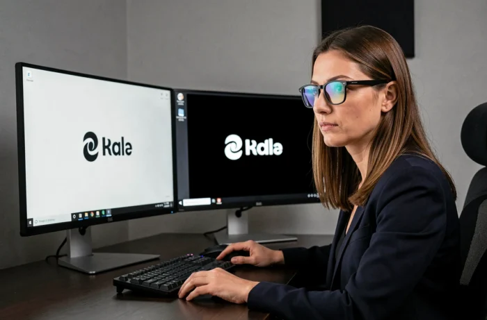
Dark mode interfaces have become the norm on mobile. A logo designed solely for a white background can become illegible on a black background. Planning a light version and a dark version from the outset avoids unpleasant surprises.
This test aligns with the logic of the adaptive system: each display context deserves its own variation.
18. Use generative AI only for initial exploration
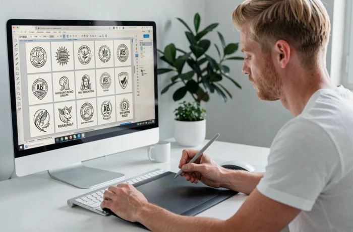
Generative AI allows for the rapid production of dozens of visual tracks. It accelerates the exploration phase by proposing combinations of shapes, colors, and typographies that a designer might not have thought of spontaneously.
However, analyses published between 2024 and 2026 show that logos finalized solely by AI pose a brand memorization problem. The results tend to look alike, which reduces differentiation. AI opens the field, the designer decides.
19. Simplify an existing logo by subtraction
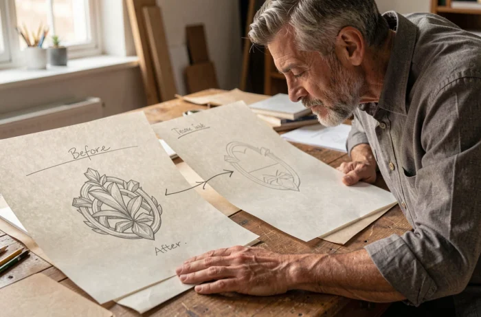
Remove one element at each iteration until the logo loses its meaning: the last readable state is the right version. This subtraction process forces you to identify what truly carries meaning in the sign.
Most redesigns of famous logos follow this logic: fewer lines, fewer colors, fewer details, more clarity.
20. Validate the logo with a five-second memory test

Show the logo to a group of people for five seconds, then ask them to redraw it from memory. The elements that everyone remembers are the core of the logo. Those that no one reproduces can be eliminated.
This empirical test complements the design work. It confronts the designer’s intention with actual perception and reveals structural weaknesses that no software can detect.
Each of these approaches addresses a different constraint: display medium, target, sector, budget. Combining them (monochrome first, then adaptive system, then memory test) produces a more robust result than following a single isolated creative track.